Onboarding checklists that new users actually finish
A checklist turns setup into a short list of jobs a new user can see the end of. It only works if every item is worth doing and ticks off when the job is really done.
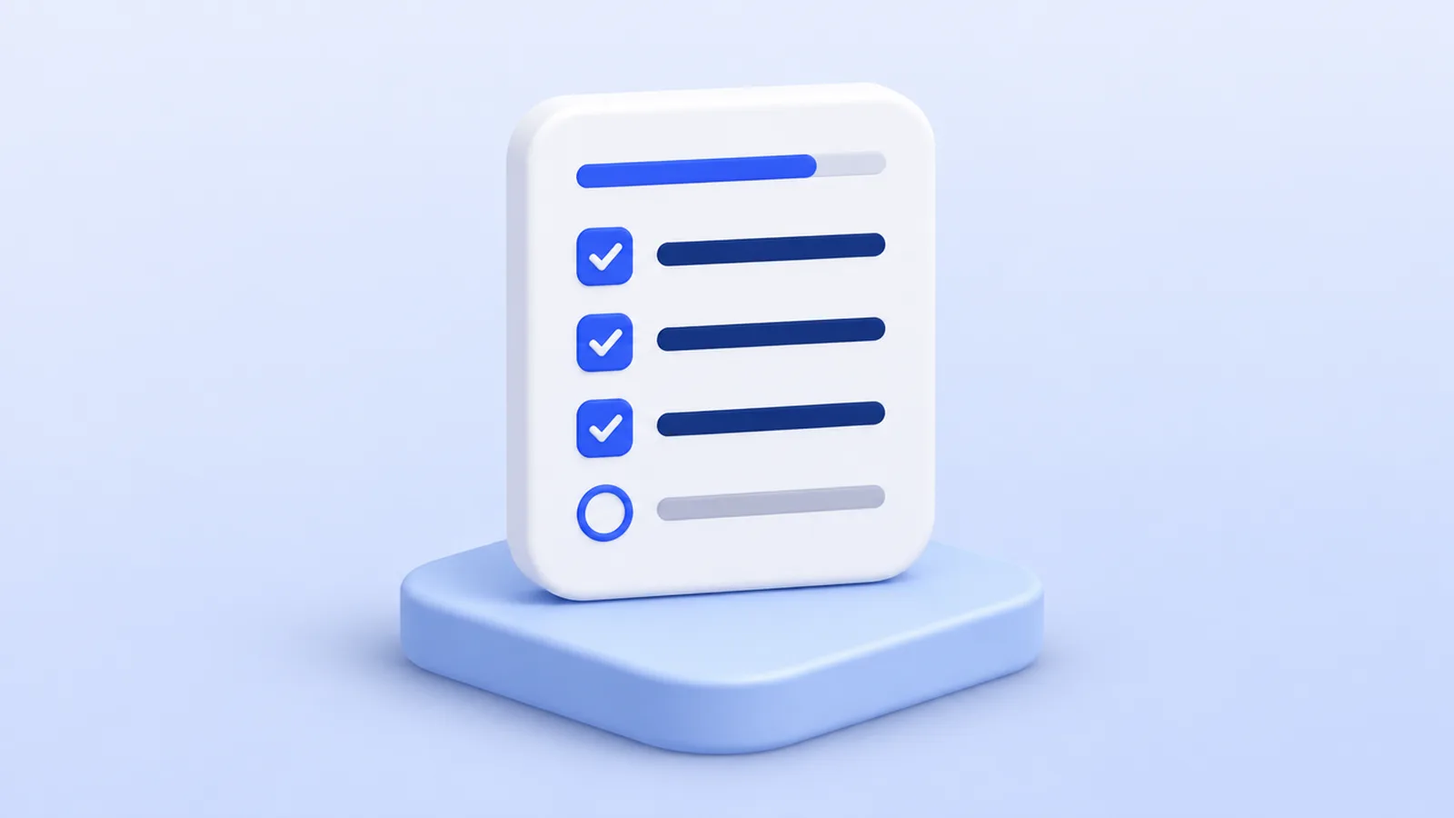
A tour shows a new user around once. A checklist stays in the corner and tells them what is left. For products where setup takes more than one sitting, that difference matters: people leave and come back, and the checklist is still there, showing how far they got.
It is also easy to get wrong. A list of eight items that tick off when clicked is a to-do list nobody asked for. This post covers what to put on a checklist, how long it should be, and how to make it reflect what the user actually did.
When a checklist is the right pattern
Use a checklist when getting value from your product takes several separate jobs, in roughly any order, that a user may not finish in one visit. Connecting a data source, inviting a teammate and creating a first report is a good fit. Explaining where the buttons are is not; that is a tour, or a few hotspots.
| Situation | Better pattern |
|---|---|
| Three or more setup jobs, spread over days | Checklist |
| One flow the user does once, start to finish | Tour |
| A few features worth discovering, no order | Hotspots |
| One new feature for existing users | Highlight or badge |
Product tour, tooltip, highlight or checklist compares all eight patterns in more detail.
Keep it to three to five items
Each item is a job the user has to do, so each one costs them something. A short list looks finishable; a long one looks like homework. Three to five items is enough for most products.
To get there, list everything a new user could do in the first week, then keep only the jobs that lead to the first moment your product does its job for them. The rest belongs in help pages, tooltips or a later announcement. User onboarding for SaaS explains how to find that moment.
Two things not to put on the list:
- Things they already did. Signing up is not an achievement on the checklist; it is the reason they see it.
- Things you want, not they. “Follow us on LinkedIn” or “Rate us” mixed in with setup tasks makes the whole list feel like marketing.
Write every item as a result
An item title says what the user ends up with, starting with a verb: “Create your first project”, “Invite a teammate”, “Connect your calendar”. Under it, one sentence on why it matters: “Your team sees the same projects as you.”
Avoid naming the screen (“Go to Settings → Integrations”). The user does not want to visit Settings. They want their calendar connected, and the item can take them there.
Give each item a way in
An item that says “Invite a teammate” and nothing else leaves the user to find the invite screen. Each item in a Stepsome checklist has a Button with three choices:
- None: just the text. Fine when the item explains itself.
- Link: opens a page in your app, for example
/settings/team. - Tour: starts one of your tours, so the user is walked through the job right where it happens. Label it something like “Show me”.
Tour is the strongest of the three: the checklist says what to do next, and the tour shows how. Keep in mind that the tour has to be published in the same site file as the checklist, or the button has nothing to start.
Tick items off by what happened, not by a click
The default way to tick an item is On click: the item is done when the visitor clicks its button or the circle in front of it. That is simple, and it is also a little dishonest. Clicking “Connect your calendar” does not connect a calendar.
The better choice is By user info. The item is ticked as soon as your app tells Stepsome the job is done, and the visitor cannot tick it by hand:
Stepsome.identify({ hasProject: true, calendarConnected: true });In the item, fill in the User trait (hasProject) and Is one of (true). Now the checklist reflects the account, not the session: a user who created a project from the API, or on another device, still sees the item ticked.
This is also what makes the list honest about progress. A half-finished checklist that is correct is far more motivating than a finished one that is not.
Placement, opening and closing
Under Where and when, pick one of six spots on the screen (top or bottom, left, centre or right) and nudge it with X and Y. Bottom right is the default because it rarely covers the main work area.
- Starts open shows the list expanded on first sight. Turn it off for products where the first screen is already busy; the user then sees a small button with the checklist’s title.
- Can be dismissed lets people close it for good. Leave it on. Experienced users who already know your product should not have to look at a list for beginners.
- Shows: On demand keeps it hidden until your app calls
Stepsome.start('<id>'), for example from a “Getting started” item in your Help menu.
The checklist stays until every item is ticked or the visitor dismisses it. When the last item is ticked, it shows the text you set under When done (by default “You’re all set. Nice work!”). Turn on confetti in the Settings tab if that suits your product’s tone.
Show it to new users only
A checklist for new accounts is noise for someone who has used your product for a year. Use Audience to narrow it down, for example a trait accountAge with the value new, or plan with trial. If you already tick items by user info, the same Stepsome.identify call can carry both.
Measure where it stalls
With analytics on, a checklist reports when it is opened, each item that is ticked, when it is finished and when it is closed. Look at which item is ticked least often. That is either a job that is too hard, or one that does not belong on the list. Make the first easier with a tour behind its button; remove the second.
More on reading these numbers in How to measure user onboarding.