Product tour, tooltip, highlight or checklist: which one when
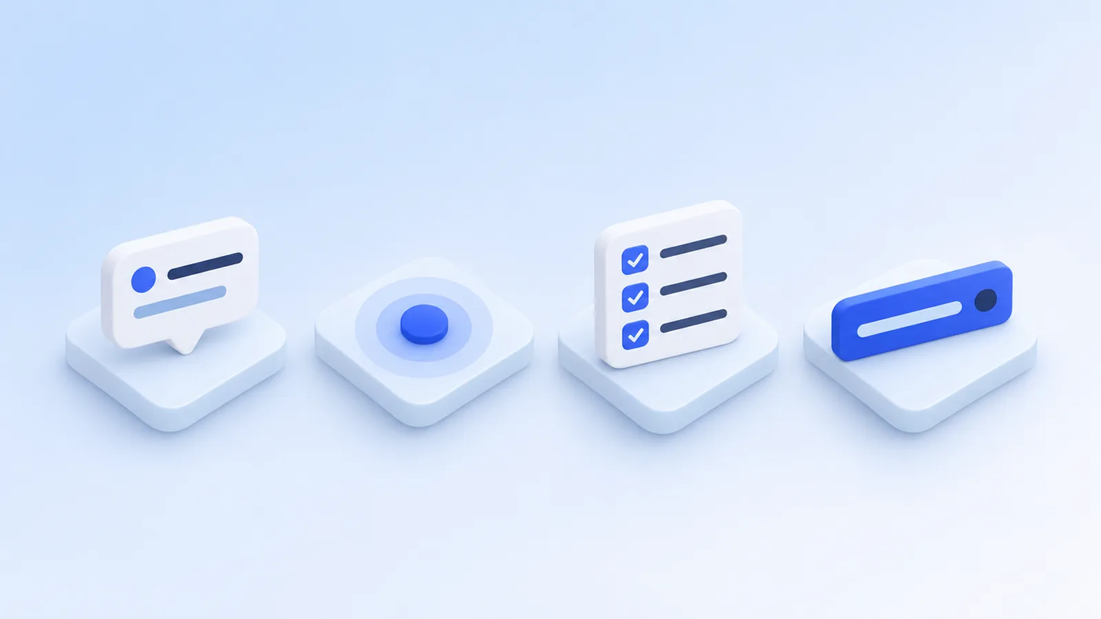
Eight onboarding patterns, one question to choose between them: how much of the user’s attention does this message deserve?
Most onboarding goes wrong in the same way: every message gets the loudest format. A product tour for a single new button, a popup for something only admins care about. The result is that users learn to close everything.
The fix is to match the pattern to the message. Each pattern takes a different amount of attention, and the user has a limited supply. This post goes through the eight patterns Stepsome offers and when each one is the honest choice.
The short answer
| You want to | Use | Because |
|---|---|---|
| Walk someone through a flow | Tour | Several steps in a fixed order. |
| Explain what a field or icon does | Tooltip | There on hover or click; never interrupts. |
| Offer help on many elements | Hotspots | Dots that visitors open when they want to. |
| Announce one new feature | Highlight | Points at it once and is gone after “Got it”. |
| Tell everyone something | Popup | A window on the screen, with room for an image or video. |
| Run a promotion or notice | Banner | A bar that stays out of the way, with an end date. |
| Get new users set up | Checklist | Tasks that tick themselves off and can start tours. |
| Mark something as new | Badge | A small label; nothing to dismiss. |
Product tour: for a flow that has an order
A tour is a series of steps. Each step puts a spotlight on one element and shows a tooltip next to it, or appears as a popup in the middle of the screen. The user moves forward with a button.
Use a tour when the order matters: first create the project, then add a task, then invite someone. That is a flow, and a tour can follow it across several pages. Do not use one to list features that have nothing to do with each other. Four unrelated tips in a row are four interruptions.
A tour is the most expensive pattern for the user, because it takes over the screen. Keep it short and let it start at a moment that makes sense: on the first visit for a welcome, or when the visitor first opens the part of the app the tour is about.
Tooltip: for the question someone has at one field
A tooltip is help text on one element. It opens On hover or On click, it has no buttons, and it is there on every visit. Nobody is interrupted, because nothing happens until the user reaches for it.
Tooltips fit the questions your support inbox already knows: what does this setting do, what format does this field expect, why is this greyed out. If you find yourself writing a second tooltip that only makes sense after the first, you are writing a tour. In Stepsome, Turn into a tour keeps what you made as step 1.
Hotspots: help that waits
Hotspots are pulsing dots next to elements. Each dot opens a tip when clicked, in any order the visitor likes, and a dot that was opened and closed does not come back for that visitor.
They suit a screen with several things worth explaining and no fixed order between them, such as a dashboard. In Stepsome, hotspots are a format of a tour: you capture the steps as usual, open the Tour tab and choose Hotspots under Format. To offer both a guided tour and hotspots, duplicate the tour and give the copy the other format.
Highlight: for one new thing, once
A highlight points at one element with a short text and a Got it button. Set to Once, each visitor sees it a single time. After Got it, the ✕ or a click on the feature itself, it does not return.
This is the right size for most feature announcements: the user learns that something exists and where it is, on the page where it lives. More on that in How to announce a new feature without interrupting your users.
Popup and banner: for news that is not tied to an element
A popup is a window on the screen. It is not attached to anything, so it works on any page, and it has room for an image, a GIF or a video. That makes it the loudest single message you can send. Reserve it for things every user of that page should know: a welcome, a change in how something works.
A banner is a bar across the top or bottom. It says its piece without covering the work. A full-width banner can push the page aside instead of sitting on top of it, and you decide whether visitors can close it for good, until their next visit, or not at all. Banners suit promotions, maintenance notices and anything else with a start and an end date.
Checklist: for setup that takes more than one visit
Some onboarding does not fit in one sitting. Connecting a domain, importing data and inviting a team are separate jobs, often done on different days. A checklist keeps them visible in a corner of the app and shows progress.
What makes a checklist trustworthy is how items get ticked. In Stepsome an item is ticked On click, or By user info: your app reports what the user really did.
Stepsome.identify({ hasProject: true });With that, the list reflects reality. An item can also carry a button that opens a page or starts a tour, so the checklist becomes the table of contents for the rest of your onboarding.
Badge: the quietest option
A badge is a small label such as “New” or “Beta” on a menu item, button or heading. There is nothing to read and nothing to dismiss. It sits inside your page and moves along with its element.
The risk with badges is that they stay forever. Two settings prevent that: Hide after removes the badge after a date, and Hide once clicked removes it for a visitor as soon as they have clicked the element.
Combine them: a small door to a bigger room
The patterns work best together. A button inside a tooltip, popup or highlight can do more than close it: under Also, choose Start a tour. A one-line highlight then offers “Show me how”, and only the people who click get the full walkthrough. The tour has to be published in the same site file.
Experienced users can be given an off switch as well. Put data-stepsome-tooltips="toggle" on a button in your app and visitors can turn all tooltips and hotspots off and on again. Highlights, popups and tours keep working.
A rule of thumb
Before you add anything, ask three questions:
- Does the user need this now to continue? If yes, a tour step or a checklist item. If no, something quieter.
- Is it about one element? Then attach it to that element with a tooltip, highlight or badge, instead of announcing it somewhere else.
- Will it still be true next month? If not, give it an end date the day you make it.
For how these fit into a complete first-run experience, see User onboarding for SaaS: a practical guide for small teams. You can see all eight in motion on the patterns section of the home page.